The Brand
GLO Naturals is a California startup creating small-batch organic teas blending wellness with artistic inspiration, offering drinks that nourish the body while stimulating the imagination.
From Product to Collectible Experience.
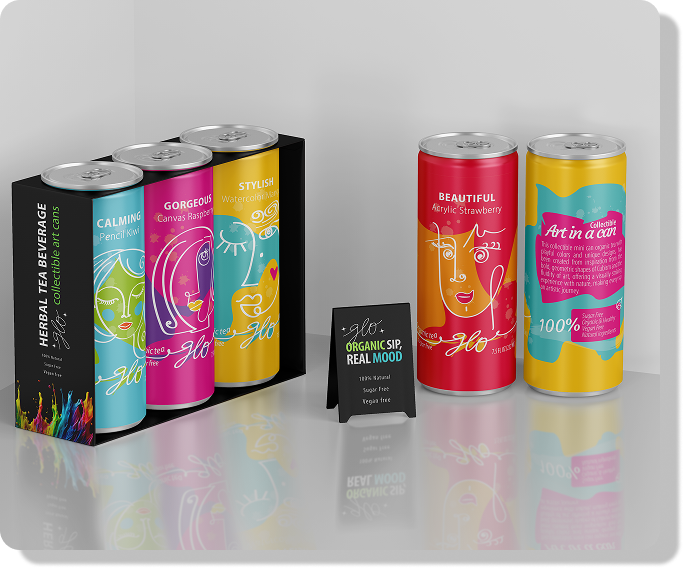
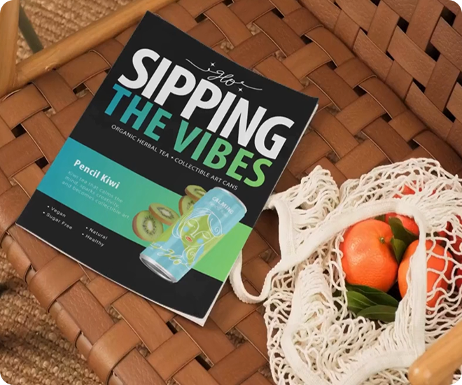
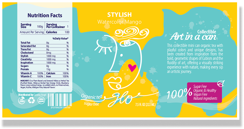
Art In a Can — A collectible Organic Tea
GLO Bev Naturals is a brand concept that explores how a beverage can become more than just a product. The goal was to design an organic tea brand that feels collectible, visual, and experience-driven. It reflects my ability to connect brand, product, and storytelling into a cohesive and differentiated concept.
How can we make a new wellness drink health-focused beverage brand stand out on the shelf?
GLO Naturals is a California startup creating small-batch organic teas blending wellness with artistic inspiration, offering drinks that nourish the body while stimulating the imagination.
Health-conscious consumers who value meaningful experiences, visual storytelling, and thoughtful design.
Color attracts attention. Design turns packaging into something worth keeping.
Creative Director
and Designer
When design becomes the differentiator in saturated beverage markets, strong visual identity can be as important as the product itself.
Through this project, I explored what I value most in design: bold creativity, visual storytelling, and the power of design to turn ordinary products into memorable experiences.
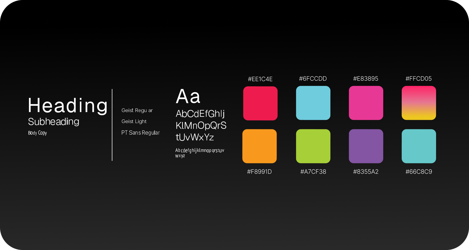
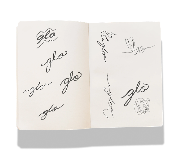
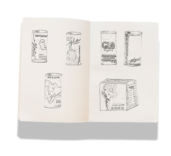
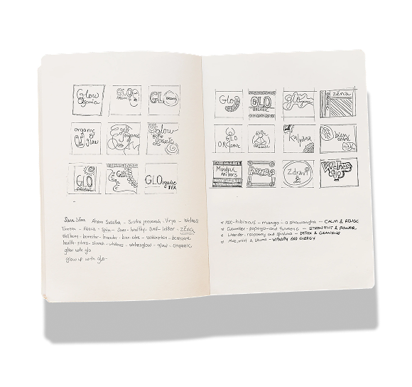
Research → Color & Typography → Sketching & Naming → Mockups
 Click to expand
 Click to expand
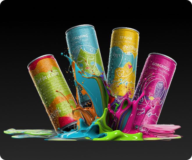
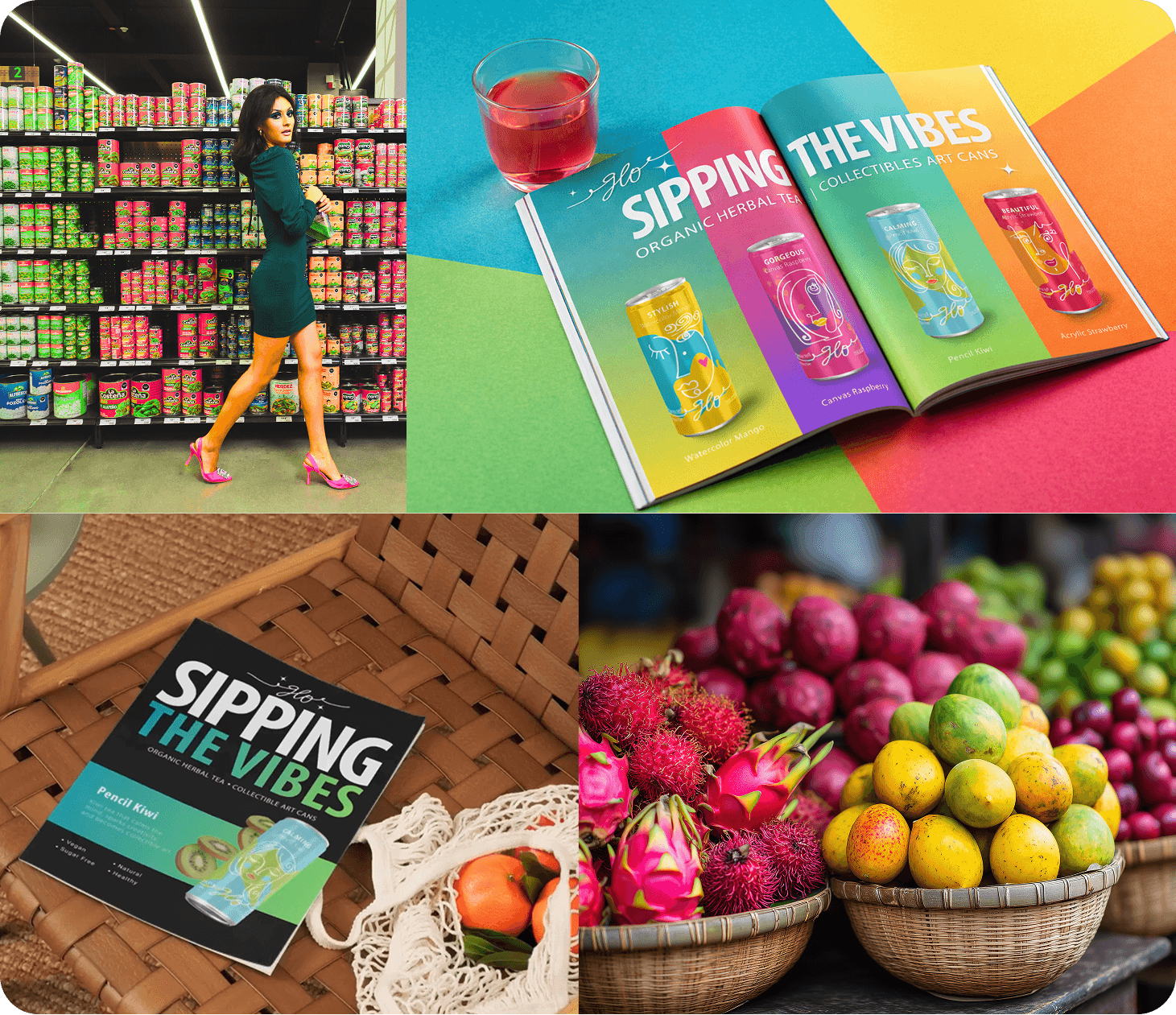
Packaging as Experience
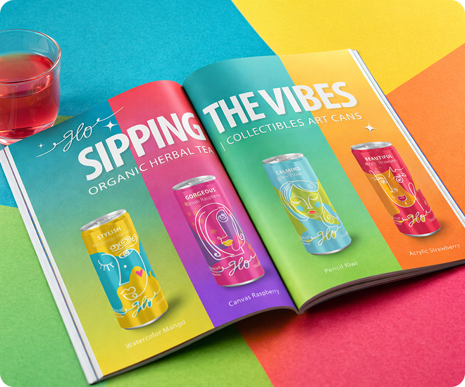
Three connected design moves that turn the product into something visual, memorable, and collectible.
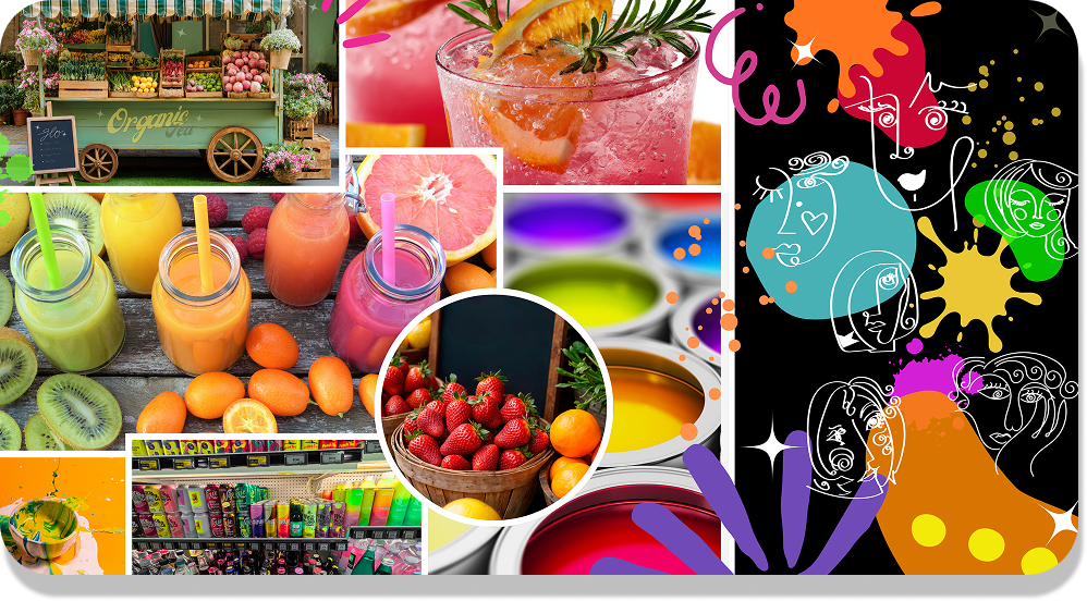
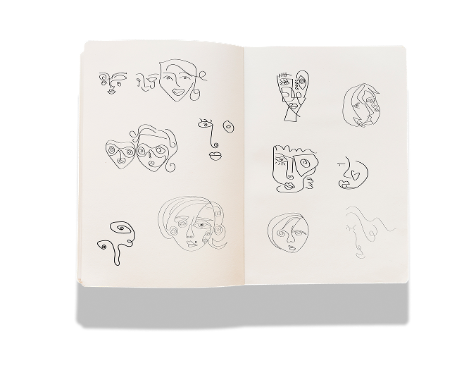
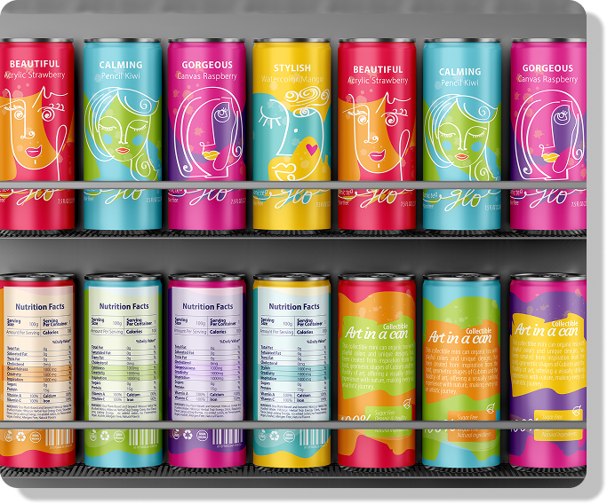
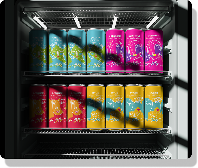
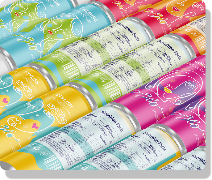
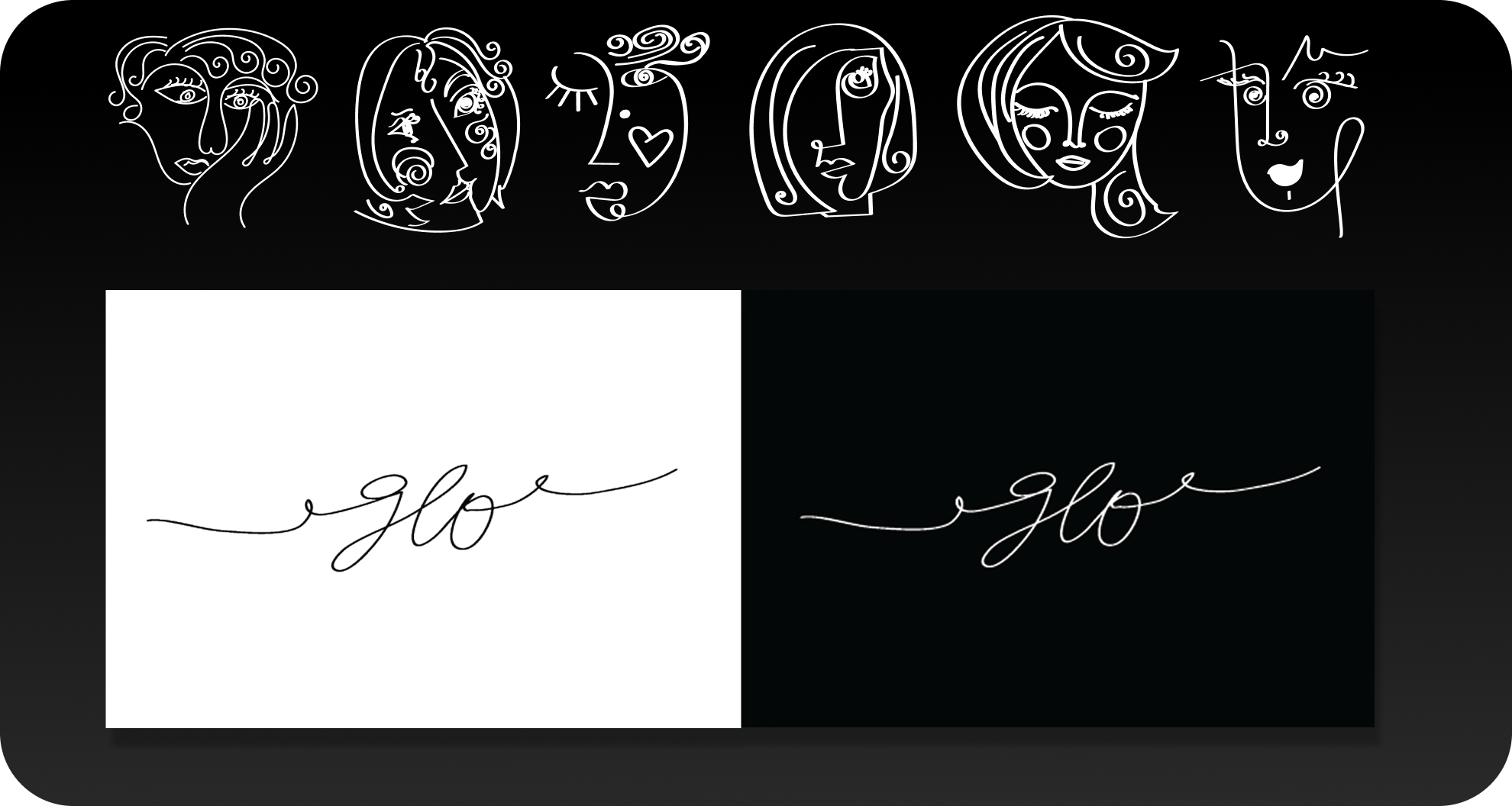
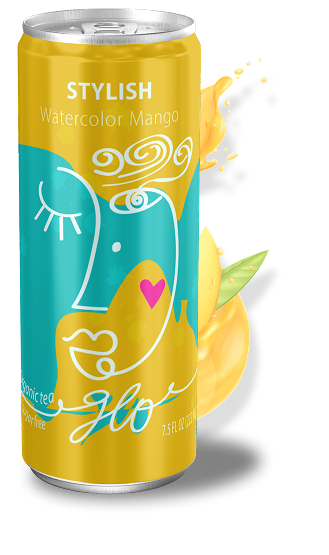
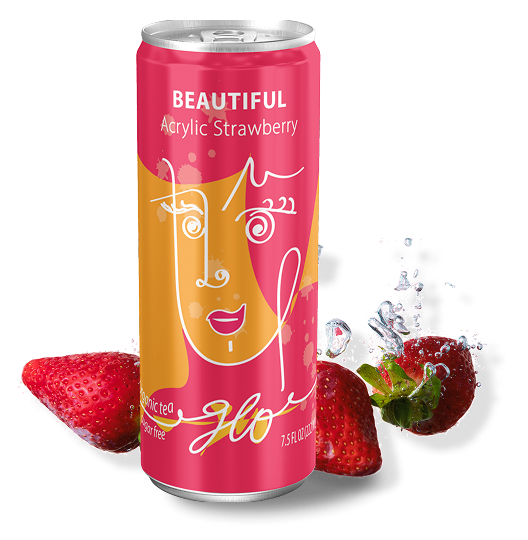
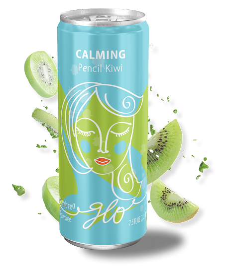
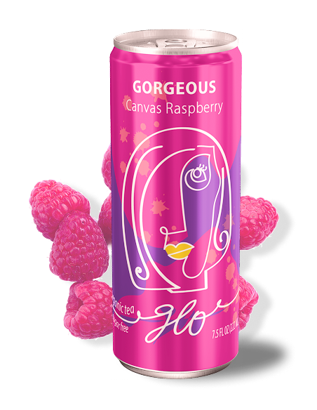
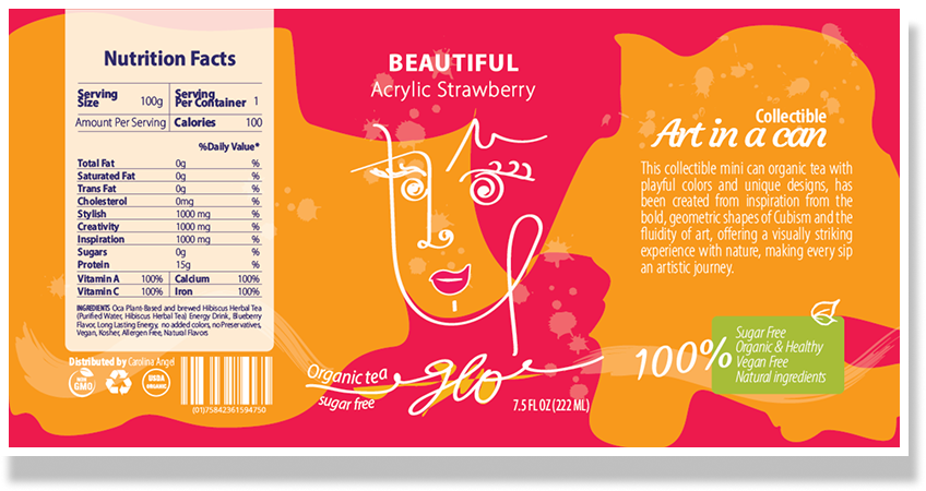
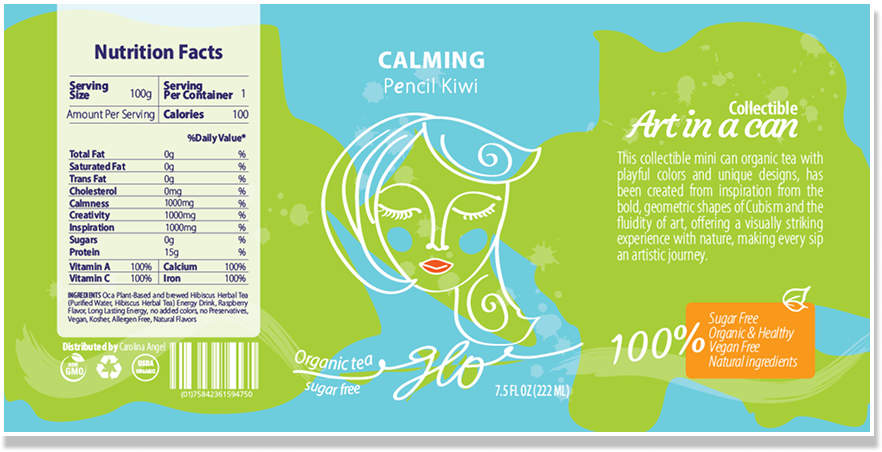
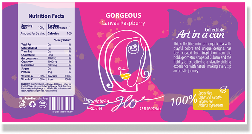
Inspired by the geometric language of Cubism, the illustrations use bold shapes and expressive lines to create a strong visual identity. The hand-drawn logo adds a natural, human touch, making each can feel like a small piece of art.
 Click to expand
Color strongly influences how consumers perceive beverages. A vibrant color system allows each flavor to feel unique while still belonging to the same brand family.
More than packaging, each can is designed as an expressive object, something to keep, not just consume.
Sipping the Vibes
What this project taught me
GLO started as a brand concept and became something I genuinely love. It pushed me to think about how design makes people feel before they ever taste the product, and how far storytelling can stretch when the brief has no limits.
Brand Identity
The strongest brands make you feel something before they explain anything. GLO taught me to design from sensation first; color, texture, movement, and let the strategy follow.
Creative Strategy
Visual identity without narrative direction falls flat. Every packaging choice, color, and name had to carry the same story, or the brand would feel fragmented and forgettable.
Visual Storytelling
When people want to hold on to it, not just consume it, the experience becomes more personal. That’s when design and brand really connect.